
I had a few comments about whether it was put upside down (in the pics), but there's no right or wrong way with these things, the models on the website depict wearing it both ways. There is no set rule as to the darker color needing to be on the lower half of the lid and vice versa, you can very well wear a dark color on the upper portion on your eye (contour), as in the Lakers FOTD I did where the purple was on top of the yellow.
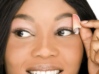
Here are the pics straight from the ColorOn website where the models show the darker orange being on top as I did in my tutorial....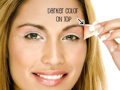
Wednesday, April 9, 2008
ColorOn Part II
.
Subscribe to:
Post Comments (Atom)


4 comments
The blending on those things do not look good imho, unless you harsh them out a bit. But I think doing makeup the old fashion way is better ;P The first model looks like she has redness from too much waxing lol :s Ok I gonna stop :P Sowwie <3
The darker color on top? Now that just don't make no sense...usually the highlight is a lighter color.
Hmm...interesting concept, still.
I like how the model is holding it the same way in the second picture.
Interesting concept, but I prefer doing it the old way.
That sunset beach shadow wasn't really the best on you. I like your own looks better. :) If it didn't fit your lids it certainly won't fit mine. :)
Post a Comment
Thanks for stopping by my blog!